How We Optimized the Hero Section for Engagement & Conversions

✍️ In this blog
From poor navigation to powerful CTAs—see how thoughtful UI elements and trust signals changed the game.
I’ve been insanely busy over the last two months designing a medium-scale website (30+ pages) for a hosting company. The old design was… let’s just say, straight out of the Jurassic era. Almost every widget needed a facelift to align with modern UX best practices.I’ll share more sections later, but let’s start with the Hero Section—the first impression that sets the tone for the entire experience.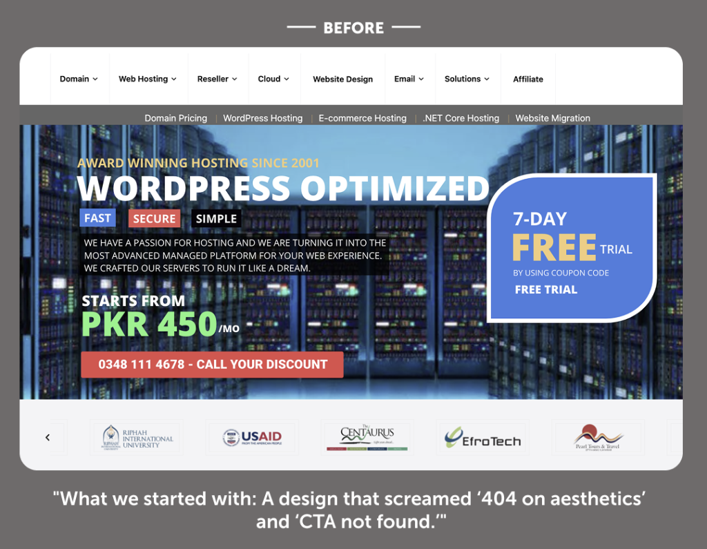
What Was Wrong with the Old Hero Section?
Honestly, it was a UX crime scene. Here are the major issues:
- Navigation was clunky and inefficient – Users had to work too hard to find what they needed.

- Domain search was buried below the fold – The primary action for a hosting site was practically invisible.
- Content visibility was poor – Key messages were lost in the noise.
- No clear CTA – Users had no idea what to do next.
- No trust signals –(A strong risk-reversal element in UX terms).
- Hero image was outdated – It didn’t resonate with the target audience at all.
- No Promo Bar or hooks – ️
- No urgency triggers – for limited-time deals to create FOMO.
- Navigation was clunky and inefficient – Users had to work too hard to find what they needed.


 ️
️
UX Improvements with Best Practice UI Elements
(Numbers in the design correspond to these improvements)When I redesigned the Hero Section, my predictions about performance improvements were spot-on. Here’s what we implemented and why it matters:
1. Urgency Triggers
We added Countdown Timers and Limited-Time Offer Bars to create urgency. This tactic can boost retention rates by 10–15%, depending on the offer type.
2. Promo Bar with Quick Access
Introduced a Promo Bar (also called an Announcement Bar) featuring:
- Free migration coupons
- Referral perks
- WhatsApp widget link for instant conversations
- This ensures users see value propositions immediately without scrolling.
3. Minimal, Interactive Navigation
I have suggested the bulky mega menu for a streamlined navigation bar with:
- Rounded-corner submenus and subtle drop shadows for better visibility
- Hover states with wire-line highlights for clarity
- Introductory text for each submenu item to guide users
- A mini promo component inside the nav to showcase quick offers
- This approach improves discoverability without overwhelming users.
4. Domain Search with Smart Suggestions
The domain search bar now includes Typeahead Suggestions (also called Autocomplete) in a dropdown. This reduces friction and speeds up decision-making.
5. Quick Offer Integration
We paired the domain search with a special domain registration offer, which can increase conversion rates by ~5%.
6. Clear Captions & Copy
Strong, visible headlines and supporting text now communicate the product’s value instantly. This is critical for comprehension and engagement.
7. Hero Image with Cultural Relevance
We designed a brand-aligned hero image that resonates with the target audience and adds cultural context. When visuals + relevance + clarity come together, brand messaging becomes 3x more powerful.
8. Prominent CTA
Added a primary Call-to-Action button—the soul of conversion. Previously, there was none, which was a huge missed opportunity.
9. Trust Signals
We introduced:
- 30-Day Money-Back Guarantee (a strong risk-reversal element)
- WordPress recommendation badge for credibility
- This alone can increase conversion rates by up to 10%.
10. Quick USPs
Added a USP strip featuring:
- Free SSL
- 24/7 Support
- 99.9% Uptime
- 30-Day Money-Back Guarantee
- This increased scroll depth by 25%, as users feel reassured and curious to explore more.
This project reflects how strategic UX improvements and data-backed design decisions can transform user experience and drive measurable growth. If you’re looking for Product Design, CRO insights, UX optimization, or high-impact presentations, let’s connect.
Further Exploration
How We Optimized the Hero Section for Engagement & Conversions
🚨 SAFE Investments: Simple, Fast—but Are They Really Safe?

Why Your First 3 Slides Decide If Investors Keep Reading (Building the Pitch Deck for GenAi Product in 2025, Step by Step)
We at Pitch Deck Guru produce several growth accelerations features for our clients according to their business needs. Most common tools include Whitepapers, eBooks, Business Reporting, Executive Summaries, and Research Articles.
Email us today!